Find us on Google+ Inventor Tales

Saturday, August 22, 2009

iLogic - Making Inventor Remember, So You Don't Have To!


Logic is the beginning of wisdom, not the end

Commander Spock (Leonard Nimoy)

After a brief hiatus, I'm back in the saddle with iLogic again. It's now starting to make sense

First of all, what is iLogic. I'm definitely guilty of sometimes jumping into the nuts and bolts of what I'm doing, without telling everyone what I'm doing.

iLogic is a utility that allows you to create rules via a simplified code. It's based on VB.Net, but doesn't require you to be some sort of code guru to make it work.

The good news. iLogic is a free add-on for subscription members from the Autodesk Subscription website here. You'll need to login. If you're not on subscription. Well, I'm afraid that you'll be on the outside looking in.

I've been looking for something meaningful to me to start creating rules for, and something began to make sense to me.

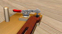
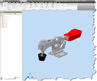
Since I love simplicity (I think that a simple solution can be a marvelous solution), I started with the 235-U Destaco toggle clamp I downloaded from the Autodesk Content Warehouse.

(Click to Enlarge)

After a little conversion, I figured out that the clamping force is 750 lbs, and the clamp height is 1.69in. I can remember, this, but I decided to use iLogic to create rule that's going to remind me what they are automatically.

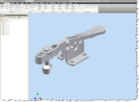
First, I get my part downloaded from the site, and opened up in Inventor.

(Click to Enlarge)


First, a disclaimer. I did change the colors of the components (initially they did come in all gray).

But aside from that, it's stock. So now to get the code started.

Step 1: Click on the Manage tab, and choose the 'Add Rule' button to start the iLogic wizard.

(Click to Enlarge)

Step 2: iLogic will ask you to name the rule.
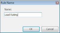

(Click to Enlarge)

Step 3: After the rule is named, the rule wizard will open. You can start typing your code now, but if you don't know code, click on the 'Rule Syntax' tab. It'll have sample lines of code that will help guide you. (See step 3)


(Click to Enlarge)

Step 3: Here I've used the Rules Syntax Wizard to put in text that is essentially my 'template' for my code.

(Click to Enlarge)

Step 4: Now for 'Message', I substitute the following

"Clamping Force = 750 lbs" & Chr(13) & "Height Under Bar = 1.69 in"

The data in the quotes is the text I want to show in my dialog box. The text '& Chr(13) &' is the code for carriage return. This will force the text to appear on two separate lines.

For 'Title' I substitute 'Clamp Stats'. This is just the title of the dialog box.

So my overall line of code looks like this:

MessageBox.Show("Clamping Force = 750 lbs" & Chr(13) & "Height Under Bar = 1.69 in", "Clamp Stats")

Inside the wizard, the code will look like this:
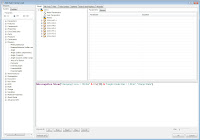

(Click to Enlarge)

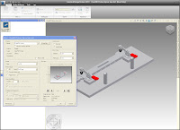
I can now close this window, and the rule is created. If you haven't made any mistakes, it'll display right away.

(Click to Enlarge)

So far, this is pretty cool. But I have one more thing I want to do. I want to set this so that every time this file opens, the dialog pops up and advises me of the clamp load. This way, I can quickly see if this clamp meets my desired requirements.

To do this, I click on iLogic utilities, on the Manage tab.
'
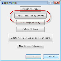
(Click to Enlarge)

When I do this, I get the list pictured below. Notice I've circled 'Rules Triggered by Events'


(Click to Enlarge)

When I click this button, I get a new dialog screen.
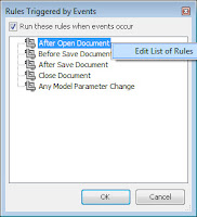

(Click to Enlarge)

You'll notice that there's one for 'After Open Document'. By right clicking on that, I get 'Edit List of Rules'. Choose 'Edit List of Rule'.

Yet another dialog box shows up, and you can check the box have the Clamp Load Rule trigger every time you open this document.
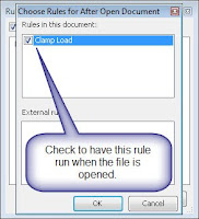

Now your ready. Hit 'OK' to close the dialogs and save the document. Everytime you open this file, the rule will fire, and you'll see the load for this rule.

That's it for iLogic!

As for me and my adventures? I was down at the Planes of Fame Museum again this weekend (I'm volunteering to be a guide, so I'm still in the training process). But I swung by and saw some of the guys working on the N9MB Flying Wing.

She suffered an engine fire in 2006 on takeoff, and thankfully made a safe landing, but she's been grounded since then while undergoing repairs. The engines have been reverse engineered (since they're no more spares), so it's been a time consuming process.

But, the parts are starting to arrive now, so hopefully within a year, she'll be up in the air again.

Unfortunatley, I didn't have my camera, and it didn't occur to me to use my cell phone camera, but here's a picture I took at the last airshow in May. In the second shot you can see where the engines are removed.


Let's hope we see her taking off again like she is below! This picture courtesy of the Goleta Air & Space Museum's website


Monday, August 17, 2009

Windows XP and Major Overhauls (Part 2)

“A good plan today is better than a perfect plan tomorrow”

Proverb

Surprise! My upgrade didn't go according to plan. So, what went wrong?

The image that I'd created a while back..... No good. I installed it, and all appropriate progress bars and blinky lights seemed to be in order.

But when I go to start my new Vista 64 bit install? BLUE SCREEN OF DEATH.

Now our first thought might be to blame Vista, because that's the most obvious target. It's not fair though. I've never used this imaging software before (Ping), so it's possible that the imaging software caused the issue, or it could even be good old fashioned user error.

Besides, once the blame is assigned, I still had to contend with a laptop that was 'bricked'.

For those who don't know:

Definition of Brick (thanks to Wikipedia).

When used in reference to electronics, "brick" describes a device that cannot function in any capacity (such as a device with damaged firmware). This usage derives from the fact that some electronic devices (and their detachable power supplies) are vaguely brick-shaped, and so those which do not function are as useful only as actual bricks. The term can also be used as a verb. For example, "I bricked my MP3 player when I tried to modify its firmware."

But as one of my friends in I.T. taught me: Have a backup plan.

What's that plan?

So I install from scratch, and as of now, my OS is up and running. It takes a couple of hours to install the security updates (tedious, but necessary). Now I'm getting my remaining software slowly installed again.

So as of right now, no screen captures, because Snagit and Camtasia aren't back on yet.

But we're on our way. Software is starting to get back installed, and my performance is noticeably better. Whatever was plaguing my system seems to be cured now.

There's still more to be done, but I'm definitely off and running.

The moral of my little adventure? When you're doing anything major like this, have a fallback plan in case the first doesn't work. I'd be in for a pretty long night tonight if I hadn't had the disks as a backup.

And while things aren't ideal, I'll be at 100% by tomorrow.

Sometimes it's not about whether or not things go according to plan. It's how well you recover when the plan goes wrong.


Sunday, August 16, 2009

WIndows XP and Major Overhauls.

“Technically, Windows is an "operating system," which means that it supplies your computer with the basic commands that it needs to suddenly, with no warning whatsoever, stop operating.”
Dave Barry

This weekend, I'm in the process of performing some serious maintenance on my laptop.

I'm razing the OS to the ground, and reinstalling all over again. Scorched Earth, so to speak.

As with most Windows Operating Systems that see heavy use, this installation of Windows XP is looking pretty ragged.

For those of us who live on the ragged edge, you've seen it. Usually your system starts getting slow, and defragging and temp space clearing only does so much good.

For those foolish or daring enough (I'm not sure which I am yet), this is the time for a total rebuild of your system. Rebuild it from the ground up.

Lucky for me, I've got some of my building blocks in place. So before we start, here's what we have.

1) An image created for Vista 64 bit on this machine. (I created it a ways back, just in case).

2) Installation disks for Vista 64bit. Just in case the image turns out to be bad. (This is my first use of it, so I'm makings sure to have a backup plan).

3) Installation disks for all my software that will eventually live on the system.

So all that is in play. Now we start the long 'progress bar rodeo' of backing up all my data. (There's no way I'm attempting this without a backup!).

As I write this, my system is backing up to my portable hard drive. That's going to take into the evening.

Tonight, I expect to get the image installed. Forunately, tomorrow is a day off for me (mental health vacation day), so I can finish out tomorrow if needed.

Yeah, I know what you're thinking. "What kind of freak are you? It's your vacation day and you're installing software?!?"

It's the best day to do it, and besides, most of what I'll be doing is letting progress bars do their thing.

In any case, wish me luck. Hopefully tonight is met with much rejoicing, instead me cursing the error of my ways.

I'll keep everyone posted!

Monday, August 10, 2009

My First 'Product Review' 3D Connexion Space Pilot

“A wise man makes his own decisions, an ignorant man follows public opinion” Chinese Proverb

So, on a note a little separate from my typical CAD Geek stuff, I've decided to post my thoughts on my SpacePilot Pro that I've been using for about two months or so now.


My SpacePilot Pro on my desk. Yes, my desk is a typical 'designer's desk'. A mess!
(click to enlarge)

I preface this with a disclaimer. These are my thoughts with my 'user' shirt on, feel free to take them and use them to formulate your own opinion.

I've also been using 3D Connexion devices for about five years now (I started with the now discontinued Space Traveler), so I'm familiar with them. It's just the SpacePilot Pro I've been getting used to.

With that being said. What is a SpacePilot Pro?

For those of us who may not have heard of them before, they're a little hard to describe. You'll hear them called '3D orbiters' (which is what I call them), or '3D mice'.

In short, they take over the Zoom, Orbit, and Pan functions inside inside of Inventor (and other CAD products they support). 3D Connexion has a nice web video HERE.

The fancier versions (like the Pro) also have buttons that can be programmed to duplicate other Inventor functions, such as starting a new sketch, or activating assembly constraints (among a myriad of other functions).

They start out with the SpaceNavigator (the least expensive and most portable), and progress through the Space Explorer, Space Pilot, and Space Pilot Pro, each adding more functionality (and of course cost).

Now with the descriptions over, lets talk about my experience with the SpacePilot Pro.

The first thing I noticed, and liked, was the shape of it. It's very comfortable. My hand rests easily on its curved shape, and the buttons are easy to get to. The puck has feels smooth and very responsive. They've definitely been improving the sensors since my trusty old Traveler.

Another prominent feature is the LCD screen. It has applets installed that will tell you what function the programmable keys are set to do, it can preview Outlook, view RSS feeds, or even be a picture viewer. A driver update also lets it show you the properties from your Inventor files.

While it may seem a little 'gimmicky', I found that the LCD did help with some of the little things, like seeing if that e-mail that came in while I was away was from my boss, or a newsletter from a vendor that could wait until later.


The LCD Screen, and some of the buttons
(click to enlarge)

The unit also feels very solid. It's got some nice heft to it, which for the most part, I like. It doesn't slide around on my desk, and lets me feel like any input I'm going to give goes straight to my model.

Last, but certainly not least, how does it affect workflow? While using Inventor, I've found that it's reduced the amount of times my left hand moves across the keyboard, especially for the orbit hot key.

The programmable buttons also unload my right hand from right clicking, or reaching for hot keys on the right hand side of the key board.

Is the change enormous? No, it's not. A model that would take me three hours to build isn't done in thirty minutes. But I do find the process of building my Inventor models to be smoother, easier, and more efficient.

Take my SpacePilot away from me, and you'll find me pawing at the left hand side of my laptop like a Golden Retriever chasing bunnies in his sleep.

As you can see, I'm a big fan of my SpacePilot Pro. If I have a bias (which I'm sure I do), you could certainly accuse me of being a big advocate.

However, as much as I like it, I can see a few drawbacks for it.

The buttons can take some practice to get used to. While this doesn't bother a geek like myself, the casual user may not get the 'seat time' to get accustomed to them. If you don't have the time or inclination for a the learning curve, it may not be for you. If you still like the functionality of having the orbiting controls, the SpaceNavigator may be a great solution though.

The price is pretty steep. With an MSRP of $499 USD, the sticker shock is pretty high. This may also cause the part time users to shy away. I think the hardcore users (like myself) will find the price more of an investment.

It's pretty hefty. While the weight makes it feel solid, it's not exactly the most portable device around, so if you highly mobile, you may not want to carry it from place to place. (I bought a ditty bag at the local camping store, and improvised a carrier from that, and the original vacuum formed packaging). A SpaceNavigator is probably the best solution for someone who is highly mobile, but doesn't want to carry the extra weight.

So in summary:

The positive:
  • It's comfortable to use
  • The buttons provide useful functionality, and are easy to reach
  • It has a solid, high-quality feel to it.
  • The LCD screen adds some subtle, but useful, functionality.
  • It improves the 'experience' of building models in Inventor
The negative:
  • They're pretty pricey
  • There's a learning curve to get used to all those buttons. It may not be for the casual CAD users (like a manager who reviews models periodically)
  • It's heavy. If you're a mobile user, it can be a lot to lug around
Ultimately, I wouldn't be without my SpacePilot Pro. I'm happy I got it, and would replace it in a heartbeat if something were to happen to it (although you have no idea how careful I am with it). I deal with the fact that it's a noticeable addition to my 'kit' when i move from place to place.

For those who want more information, you can always contact me at KETIV.

If you live in Southern California, we also have a demo station where you can try out the SpacePilot Pro for a few minutes.

Feel free to swing by if you ever want to try one out (although please let us know your coming. The unit is also used in our training labs, so we'd want to make sure it's available!).

That's it for my first product review. I hope you found it helpful.

Jonathan

Tuesday, August 04, 2009

Subtle but Significant... Displaying Coincident Constraints


"Great things are done by a series of small things brought together."
-- Vincent Van Gogh


This is one of those 'little things', but if experience has taught me anything, the little things matter. That holds true for things like Inventor as well.

While working in one of our training labs over at KETIV. A student pointed out that when they were sketching, the coincident constraints were showing up as yellow dots at the corner of the geometry.

(click to enlarge)

The dots representing the constraints are benign. They only server to tell you that the constraint is there. But, they do add clutter to your screen, and if you subscribe to my theory, I've got enough clutter in my life, at the very least I can get the clutter off my computer screen!

So how do I get rid of the dots?

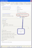
Go to Tools>Application options, and choose the 'Sketch' Tab. On that tab, you'll find the option to uncheck the display of the those dots.


(click to enlarge)

Unchecking that option will remove the dots, making for that cleaner, uncluttered look preferred by many.

Note: You may have to right click and 'hide all constraints' to clean the point off the current geometry, but once this option is deselected, you won't have to worry about it appearing on new geometry.

(click to enlarge)


Happy Inventing, everyone! Don't forget the little things!


Friday, July 31, 2009

Hotfix for Autodesk Design Review and PDF Printing


Home computers are being called upon to perform many new functions, including the consumption of homework formerly eaten by the dog.
Doug Larson

Something I guess you might consider from the "Public Service Announcement' desk.

The other day at KETIV, I was asked about an issue where pdfs printed from DWF files in Autodesk Design Review were taking a much longer to print out than in previous versions.


A quick check of the Autodesk website showed that there's a hotfix for this,so it should be an easy fix.

So if you're seeing this issue out of Design Review 2010, just grab the hotfix HERE, and you should be on your way with faster PDF creation!

Have a great weekend everyone! I'm off to my volunteer gig at the Planes of Fame again, so that alone is going to make it a great weekend!

Jonathan

Tuesday, July 28, 2009

Beauty and the Eye of the Beholder - Textures in Autodesk Showcase


Everything has beauty, but not everyone sees it. ~Confucius


I've blogged on bump mapping in Autodesk Showcase before, but with so many things in Showcase, it seems like it's as much art as science.

Of course you can add materials in Showcase, and in previous blogs (click here) I talked about how you can use bump maps to add 'character' to a material.

But at times, when trying to use bump maps, you end up with a ray traced image that seems to be grainy. Look at the clamp below. Everything seems fine, but the clamp definitely has that 'grainy' appearance.


(click to Enlarge)

You're first instinct might be to crank up the resolution, but it doesn't seem to help. Trust me on this: I've tried it. It eats up processor time, and doesn't improve the quality of the image. It also tends degrade the temperament of the operator.

But there is hope for both the image quality, and operator mood!

As with many things with Showcase, this is somewhat subjective, but one things that operator instinct seems to be to make a bump map far deeper than it needs to be.

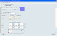
Even looking at the bump map that I've used (unaltered from the Showcase material library) has a bump depth of 1.0, which is pretty high. You might think it's the highest possible setting, but I've found that typing in a higher number will let you go higher than 1.0.


(click to enlarge)

The solution that I've found? I drop the depth of the bump map down. And when I say down, I start cranking it WAY down. I usually cut it in half, then half again, and repeat that process until I get to the result I like. So if I start a 1.0, I go down to 0.5, then 0.25, etc.

You should be able to find a value that works. In this case, I found that I got to a value of .125before I was happy with the result.

So you can see how just changing that bump map can change the look of the file. Other settings you can user are the angle of a bump map, as well as the scale. (For example, I also changed the angle and scale of the wood grain to make it more appealing).

(click to enlarge)

While subtle, each of these settings play their part in
helping create a rendering that is really eye catching.

As another example, here's a box with only the bump depth changed. In the first image, the bump depth is at 1.0. I refer to this as 'having a brushed finish applied with a chainsaw). Feel free to use that, but I want the credit! :-)

(click to enlarge)

Now, setting it to .032 (with a few iterations in between), we get to something that's a little bit more subtle, and far more compelling, I think.


(click to enlarge)

Have fun trying different settings, and try something a little bit 'crazy'. You may find that it makes the rendering really 'pop'.

In which case, you get to make the transition from 'crazy' to 'visionary'.

As for the jig? Here's teh full image, I cleaned up a few things, and gave it a tilt. Here it is in all it's ray traced glory.

(click to enlarge)

Enjoy, and have a little fun trying different variations of these settings. I find it's when I'm having fun, I do my best work in Showcase.

Friday, July 24, 2009

Stranger in a Strange User Group.


Not until we are lost do we begin to understand ourselves.

Henry David Thoreau

Last night, myself, as an Inventor User, found myself in what can definitely be considered foreign territory.

I found myself in an Autodesk Revit users group.

No, I didn't get lost on the way home.

I was looking into the new AEC Exchange functionality in Inventor R2010, and how it talks to Revit.

But I'm a manufacturing guy. I change my own oil, think unburned fuel may as well be perfume, and believe that the sound of a P-51 Mustang running at full power is the the sound of angels singing.

Those who've heard, know.
(click to enlarge)

Architecture? Well, that's not my gig, let the pros take care of that, right?

But there's an undeniable fact that users of Inventor have to create files for buildings (after all, that air conditioning system is being manufactured somewhere, isn't it?)

I'm fortunate that Jay Zallan, Autodesk Revit User Extraordinaire and BIM Scholar invited me to the South Coast Revit User Group (SCRUG) to visit.

I was really impressed by the energy of the meeting, everybody was energetic, passionate, and constructive about how to best use Revit.

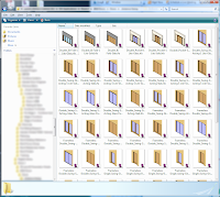
Door Families. The topic of the night.
(click to enlarge)

They were also very welcoming to a somewhat curious and puzzled Inventor user who had passed through the looking glass into an architectural world.

Moreover, they were more than willing to offer their help and guidance as I learned more about the things that are vital to the project they're work with on a daily basis.


Look! I library of doors! Library... We do speak the same language!
(click to enlarge)

I have to say that I left their group more excited about the possibilities than I had when I was when I arrived.

I'm really looking forward to having a chance to work with them in the future!

Look to upcoming blogs on our progress on AEC Exchange!

Happy Weekend everyone! It's about that time here in California!

For more information on AEC Exchange, here's the Autodesk video that discusses it. Note the epic 'Announcer Man' voice. :-)


Wednesday, July 22, 2009

Content: Why Reinvent the Wheel when You Can Download it?


One of the Internet's strengths is its ability to help consumers find the right needle in a digital haystack of data. ~Jared Sandberg

Not that long ago, I was talking with a friend at PARTsolutions about finding content on the internet. While much can be done with various search engines, he reminded me that sometimes more quaint forms of communication, such as putting your Blue Tooth headset in your ear and making a cell phone call in the car on the drive home, are still valuable ways of communication.

It was during this conversation that he reminded me that Autodesk has its Manufacturing Supplier Content website available.

Granted, I had heard this before, but somewhere it had fallen behind the file cabinet of my mind and gotten lost.

So I went to the website HERE and took a look.

I did have to create a login, but I went ahead and created one, and took a look.

Enter the beam of light and the choir voices singing...

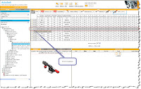
The image shown in the screen capture greeted my eyes.


(click to enlarge)

So much content.... It was just so.... pretty... and contenty....

Once I shook off the initial shock. I decided to check out some content. After one aborted attempt, I double checked some settings. This will setup the default format to download.


(click to enlarge)

With those preferences saved, I went out and chose a component to download. I noticed DeStaco clamps was one of my choices, and I used a grip of DeStaco clamps when I was in industry. So that's who I went with.

(click to enlarge)

I clicked through a couple of sections, and got to the good ol' toggle clamps that were an ever present part of some of the fixtures I built. I even found a part number that I recall using, complete with preview.


(click to enlarge)

Once I found the part, I clicked on the Part Download button (which looks like a little Socket Head Cap Screw) and the site built the parts for me to download. The down loadable content will appear in the lower right hand side of the screen, and you can click on the 'disk' icon to download it.

(click to enlarge)

Once you click on the download icon, you'll be asked to save a zip file to your drive. Extracting the zip and opening the file in Inventor, here's my result.

In a few moments, I have the clamp as an assembly that I can use in a design. It's accurate, and up to date, straight from the source.


(click to enlarge)

Granted, all the parts are grounded, but I can add the constraints pretty quickly. I even changed the colors of the parts to look a little more realistic.


(click to enlarge)

If you really want to go wild, you can even add positional representations and create the open and close positions for the clamp.


(click to enlarge)

The key, I think, is the fact that the geometry (which is the heavy lifting) is already there.

However far you decide to take this. You can (and probably ought to) save it in some sort of library, be it a location on the server, or checking it into Autodesk Vault.

Now your off and running on other components of your design! I know I'll be checking back on this site quite often now!

Happy Wednesday!

Jonathan


Sunday, July 19, 2009

What's Old is New Again. Multi-Bodies and Frame Generator in Autodesk Inventor


“Invention, strictly speaking, is little more than a new combination of those images which have been previously gathered and deposited in the memory; nothing can come of nothing”

Joshua Reynolds (British Painter, 1723-1792)

Sometimes, inspiration really does hit you out of the blue.

A little while ago, I was working with the new multi-body functionality inside of Inventor (see blog post HERE).

Then the inspiration hit me. I can use solids as a skeleton in Frame Generator, what happens if I us the split tool to split the skeleton?

No way to find out but to try it, right?

So I built a frame using Frame Generator, with a solid for a skeleton. The frame members that I've placed run the entire length of the skeleton.

(click to enlarge)

I want to break them up into two sections (let's say that it's for ease of manufacture). How can I do that?

This is where that split tool can come in handy. Used the split tool to split the body into two.

I go ahead and edit the skeleton (in this case, the blue box). I'm using a workplane in this case, although I could use an extruded surface as well.

(click to enlarge)

With a workplane placed on the skelton, I can go to my Split tool, and split the solid that represents my skeleton into two pieces.

(click to enlarge)


Once I hit 'OK', and the body is split into two separate bodies.

(click to enlarge)

With the bodies split, I finish editing this part and return to the assembly level. The members will adjust to follow one of the bodies. (Note, that you may need to remove existing end treatments before they do this).

(click to enlarge)

Now you can add new members, using two lengths to fill this section. You can also add any welds or gussets you may need. Here I've added the red and green members (among others), as well as the black gusset).

(click to enlarge)


The time to alter the design was pretty small (around 15 minutes). If I zoom in closely, you can even see where I added welds to the frame using the welding environment.

(click to enlarge)

That's it! I hope this helps!

Also, for more information on Frame Generator, particularly customizing Frame Generator, check out Rob Cohee's video HERE! And check out some of his other videos too. They're entertaining and informative!

Also, check out the Tips and Tricks section on the KETIV website HERE. We at KETIV a pretty excited about it!


Tuesday, July 14, 2009

Mutiple Bodies, Multiplied Flexibilty

“Stay committed to your decisions, but stay flexible in your approach.”

Tom Robbins (American Novelist. b.1936)


I've been working with the new multi-body workflow inside of Inventor R2010, getting used to it's workflow, especially if you're an old warhorse like me who remembers tool bodies in Mechanical Desktop (how's that for a flashback!).


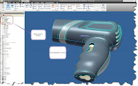
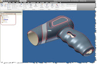
If you read the data on Inventor's multi-body tools, you'll see that it's a natural fit for plastic part creation. For example, here's the plastic cover for a hair dryer

(click to enlarge)

The cover has been modeled as a single part, because it's easier to create it that way than it is to create it as two parts that you're going to try to make fit at the end.


But the challenge doesn't lay in the creation of the part. It lays in the fact that when we finish creating the shape, we still have to create two separate parts. Inventor had this capability for some time (using derived components), but now it's become a much easier process.


Instead of creating new components and creating two files, the multi-body functionality in Inventor lets you create the separate bodies inside the part file. Which in the end, makes for a more efficient workflow.

In this example, we're going to use an origin workplane to split the part down the middle (where the parting line will be.


(click to enlarge)

Naturally, the tool used to split the part, will be the split tool, of course.


(click to enlarge)

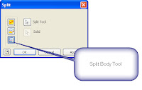
Once activated, those who remember the split tool from earlier releases will notice that there's a new button in Inventor R2010.

(click to enlarge)

This function breaks the file into two distinct bodies, although they're still maintained in a single file. The bodies will show in your feature browser, and will highlight in the drawing window when you show them there.
(click to enlarge)

Note that if you right click on the solids, you can choose 'Properties' and give them more sensible names.


(click to enlarge)

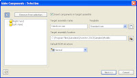
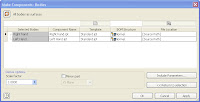
Once the body is split, you can go to the 'Make Components' tool on the manage tab, which will walk you through the wizard to create new distinct parts.


(click to enlarge)

With this tool started, Inventor opens up a window that allows us to choose the bodies to export, whether or not we want to place them in an assembly, and what directory we want to place the assembly in.

(click to enlarge)

Once we have our desired settings, we can hit the 'Next' button. Here, we can choose the file names, and the directories for the parts to be created. Also notice that there's a scale factor (which comes in handy if you have shrinkage factors to account for).


(click to enlarge)

Hitting 'OK', builds the part, and (if you chose to do so) inserts them in the assembly. And Viola! Two parts from one! The files link back to the original part file that generated them.


(click to enlarge)

Of course the next question, maybe 'So what? Just because I can, doesn't mean I should, would, or ought to.'

Fair question. I can, but why would I
want to?

If you look up a few lines, I wrote 'The files link back to the original part file that generated them.'

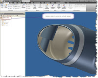
This gives us the abilty to go back to that model, and make changes there, and have them propagate back to the components. In other words, mating features (like the bosses shown here) components can be placed in the original model.


(click to enlarge)

And those changes will show in the assembly when updated. Since we lined them up in the original model, we know they're lined up perfectly, without the use of adaptivity or constraints. That's where you really start to see this spread its proverbial wings! More to come. There's a lot more that can be done!


Jonathan

www.ketivtech.com