Find us on Google+ Inventor Tales

Monday, July 13, 2009

People are People... Importing Humans into Autodesk Showcase

There are two types of people - those who come into a room and say, "Well, here I am!" and those who come in and say, "Ah, there you are."

Frederick L. Collins


This question was posed to me about a week ago: "How do I get human forms into Autodesk Showcase?

Since Showcase doesn't build models, we need to get them from somewhere else. One of the most common places is from Charlie Bliss's site HERE. I've used 'iMike' a number of times.
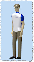

(click to enlarge)

The people here are great for the concept of scale in a project, but they're not very realistic looking.

There is a way to do it, although it does take a bit of determination. But once that grunt work is done, you have something that you can place in your library, and (hopefully) never have to change it again.

Whats the big secret. Look for files 3ds files (the native Autodesk 3ds Max format). There are models of people to be found out there.

I found a decent selection on Klicker HERE. This is a great starting point.

But now we have a challenge to overcome. Showcase doens't import 3ds models. So now what?

Well, if you have AutoCAD and a will, you have your way.

In AutoCAD, you can go to the Insert Ribbon and choose Import. Also, if you're in the classic setting you can go to File>Import, or if you're an old school typist like me, just type 'import'.

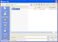
(click to enlarge)

One of the options on import is a 3ds file. I'm using one of the samples I downloaded from Klicker.


(click to enlarge)

When you hit open, the import options appear. You can choose what and what not to import (such as lights for example). I click 'Add all' and hit 'OK'.
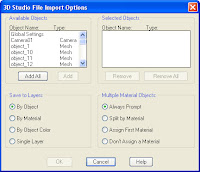

(click to enlarge)

AutoCAD will crunch a while, and you'll see a polyface mesh of the imported data (in this case a man).

(click to enlarge)

Now all you have to do is save this file as a *.dwg.

With the file saved as a dwg, you can open up Showcase and go to File>Import Models, and choose the dwg you just created as the file to import.
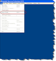

(click to enlarge)

Showcase will chug a bit, and you should see your import appear now!


(click to enlarge)

You're almost there. You may need to check the normals (not well adjusted people, the surface normals). There's a chance that not all of them are facing the correct direction.

You can do this by hitting 'F2' to show the normals. When they face the correct direction, they'll be blue. If they're yellow, select them, and hit 'F3' which will reverse them.

Why do we want to correct them? If we don't they may not show lighting and shadows correctly, which will make those areas look dark.

Here two surfaces face the wrong direction.
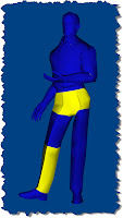

(click to enlarge)

Normals corrected.

(click to enlarge)

Now a few tweaks to materials and the addition of an enviroment, you have a much more realistic looking person. It's certainly not on the level of something you'd see out of a Hollywood special effects department, but it has more realism that iMike (not to insult him).


(click to enlarge)

Aside from the fact that he's taller, better looking, and thinner, I think he bears a striking resemblance to me.

Now just save him in a directory where you can use him over and over again if you need him.

One last thing. Will ever single model come in this slickly? In a word: No. I've had some that have been pretty tough.

I've been able to bring these into Autodesk Inventor and clean them up and bring them into Showcase, but I'm still pinning down the best way to do this. Once I get that nailed down, I'll share that too!

Happy Monday everyone!

Wednesday, July 08, 2009

A Geeks Humor..... Be Careful what you Assume


"There is always an easy solution to every human problem— neat, plausible and wrong.
"
H. L. Mencken

Learning Autodesk Inventor, Showcase, and Vault (among other things) are often exercises in learning a process as much as the product. After a frustrating evening, I've decided to share a bit of an anecdote, and out of a need to laugh. Even if must be at my own expense.

Earlier tonight, I installed Internet Explorer 8.0, plus a .Net update, among others. I'm figuring I'll go ahead and test out the new version of Internet Explorer (being a Firefox guy, I'm wary of new versions of I.E.).

I shut off my laptop, head home after a good day at the office, and do my evening drill (stop by the grocery store, make dinner etc).

After dinner, I sit down in front of my ever present laptop (me without my laptop is like a gunfighter without a six shooter), and decide to jump on my wireless network

A few mouse clicks and....... nothing. Wireless my wireless doesn't connect, no internet. I'm knocked off the grid.

I murmur to myself. It must be a wireless setting. After all, I just installed those updates. They must have done something. I dive into my wireless settings and start dissecting my system.

Nothing's wrong, and nothings working. My murmuring turns into grumbling. More clicking of mouse buttons, and gnashing of teeth. Still nothing.

My frustration level goes. Grumbling turns an incoherent conversation with my laptop using language that makes mothers blush and cover the ears of young children.

Even using this level of diplomacy, my laptop fails to offer any suggestions.

I even try uninstalling and reinstalling the updates. Still nothing! GRRRRRRRR!

Finally I grab a spare network cable and walk to my wireless router. Determined to emerge victorious, I plug directly into the router.

My laptop flashes a message that my network cable isn't plugged in. I pace the room like a caged animal. Could it be that the updates have seriously messed up my network connections?

Good grief, does that mean that I may have problems at work tomorrow? What if I have to reinstall the OS? The muscles in my back tense at the thought.

I spend a few minutes trying different combinations of cables and ports.

No luck. Absolutely nothing. I'm starting to wonder if something has seriously gone wrong with my laptop.

Then, my eyes fall upon the router itself. And I realize something that I should have noticed right way, if I'd checked.

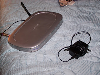
Every single light on the router is out.

THERE'S NO POWER TO THE ROUTER! THE POWER SUPPLY WENT BAD!

I grab a spare power supply, plug it in to my router, and in a minute or two. The router lights are happily blinking away like the lights on a Christmas Tree, and my laptop blinks up the happy message 'Wireless Connection Status: Connected"

Exhibit A: The perpetrator and accomplice in tonight's little 'challenge'.

I had spent the better part of TWO HOURS trying to fix something that wasn't the problem in the first place.

And to add insult to injury, all I had to do was double check that the router had power.

That's my lesson for the evening. With my problem solved, I've had a good laugh at my own expense (I definitely earned it).

And the next time technology goes 'sproing!' on you, no matter what the technology, take a deep breath, and make sure you don't jump to any conclusions.

Sometimes the solution is really as simple as double checking to make sure the lights are on....

Joanthan Landeros


www.ketivtech.com

Monday, July 06, 2009

Autodesk Showcase - Recalling Your Past (Materials)

"I hear and I forget. I see and I remember. I do and I understand"
Confucius

In my last few posts, I've talked about creating new materials, primarily by using bump maps. But there's so much more you can start doing. I've already started toying with things like highlights, reflection blurs, and highlight colors among other things. Already I find myself thinking of all the things I can start blogging.

But before I start talking about that, I decided that I wanted to talk about how we can take the material we created, and make it available to other Showcase renderings I'm going to create in the future. For example, here's the 'Rippled Metal' I used in my previous post HERE


(Click to Enlarge)

The downside of what I've talked about so far, is that this material is only available to the file I created it in. material I've created in. In other words, I can't easily access it from another file. Some of these materials can take a while to create, and for reasons such as consistency, and a desire not to have to do the same thing over again, it's very desirable to make this material available elsewhere.

The answer: A Materials Library.

This is a way to create an external library where I can access this material I created.

So, with all that done, what are the steps

First, I bring up my materials list by going to the Materials>Materials pulldown, or just hitting 'M'.

I've already created the material, but I should give it a proper name that will help me pick it out of the library in the future.


(Click to Enlarge)

First, I right cilck on the material, and choose 'Rename'. I enter the proper name, in this case, I'm calling it 'Rippled Metal'. One word of warning. Showcase keeps the materials in alphabetical order. So if the material was named 'Steel xxx', and you rename it to 'Black Steel' (for example), it will reorder. It might make you gasp a second.

This can surprise you if it moves out of sight. Don't worry, just scroll back to where it reordered. Don't forget to start breathing again. :-)

(Click to Enlarge)

Now with the material renamed (and relocated), right click on it, and choose 'Save to Library'. Since we've not created a library yet. Our only option is to create a new library. Which we'll do.


(Click to Enlarge)

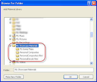
Showcase will ask us where we want to create the library. I'm using a laptop, so I put it in the 'My Documents' folder, where I've created a folder called 'My Showcase Materials'. If you're in a collaborative environment, you might want to consider a shared folder on the network. This way you can keep all the materials in a separate location where it's backed up.


(Click to Enlarge)

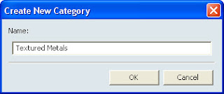
Now, Showcase asks me for the category to create for the file. this is another way to organize your materials (plastics, metals, fabrics, for example). Here I've just called it 'Textured Metals'


(Click to Enlarge)

That's it! You've not got a library that can be easily accessed in new files!


(Click to Enlarge)

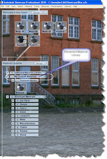
There is one last thing. Showcase by default, names your library after the path it's located in. You might or might not want that. If you right click on the path in Showcase, you can rename the library to anything you'd like. Note, this is also where you can add, remove, and edit the library, categories, etc.


(Click to Enlarge)

Now you're ready to go!


(Click to Enlarge)

I've got some more materials blogs planned soon, check back for those a little later!

In closing, you might ask why I don't put it in the install directory, with the rest of my Showcase materials?

For me, there's a very specific reason I don't. I done that with other programs in the past, and when I've upgraded from one version to another. I sometimes forget to back up those files before I delete the directories. I've lost quite a bit of data that way (for some reason I never learn my lesson on that one). So this is how I project myself, from... well, myself.

Have a good week everyone!
Tuesday, June 30, 2009

The Devil in the Big Box (Bump Maps in Autodesk Showcase)

"Somehow our devils are never quite what we expect when we meet them face to face."

Nelson DeMille

One of the challenges I've found in Showcase has been something I've started calling 'The Devil in the Big Box'. They're renderings that involve larger objects with large, smooth sides, like a CNC milling center for example.

When you model an object like this in a 3D modeler like Autodesk Inventor, the sides are perfectly smooth. And when I mean perfectly smooth, I mean 'unrealistically perfectly smooth'. In truth, the side isn't 'perfectly smooth' but has slight waves and variations in its surface.

It can show up on any surface, but models with large flat sides seem to be the models that make the effect glare at you.

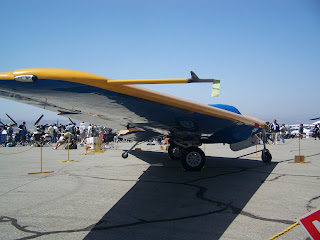
Using one of my airplane examples (again), here are some pictures of N-9M-B Flying Wing at the Planes of Fame museum.

(Click to Enlarge)


(Click to Enlarge)


(Click to Enlarge)

If you look at the pictures of the leading edge and underside of the wing, you can see where the surfaces that would be smooth have small dips and variations that cause ripples in the reflection.

Adding the right bump map can help add that 'character' to that surface.

So what did I do that gave that surface a little bit of that 'imperfectness' and add a little more realism? I added a Bump Map.

For starters, what is a bump map? A bump map is a texture image that creates the illusion of depth and texture without changing the actual geometry involved. There's a pretty good definition HERE (thanks to KETIV collegue Nicole for helping me find that!).

Example of a Bump Map

(Click to Enlarge)

They're used to give a smooth surface the appearance of being made out of leather, carpet, or textured plastic (among other things). All from a surface that has no texture of its own.

But one of the things I've discovered is that by the careful use of bump maps, you can get rid of that 'too perfect surface' that results in a rendering that isn't all it could be. Here's an example of a box without a bump map. It looks good, but with a bump map, you can get some interesting surface effects.

First, here's a rendering of the box without any bump map. The surfaces are as smooth as when they were built in Inventor.

(Click to Enlarge)


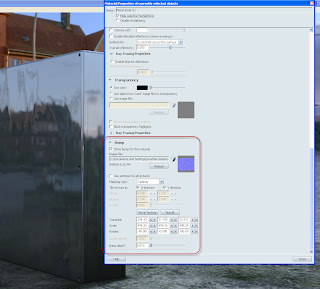
To add a bump map, select the surface you want to change and hit Ctrl+M. This will access the material screen. Once in the screen, scroll down to the bottom and add the texture you want.

The default directory is (install directory)\Materials. The normal maps (the ones that I've found work best for Showcase have the word 'Normal' in the title, and have a the gradient in them (opposed to the gray scale images).

(Click to Enlarge)


The standard libraries will get you a long way, but if you want to add more, one of the easiest ways is to just pick your favorite search engine, and look for 'Normal Map' or something similar.

You can also change the scale, rotation, and bump depth of the bump map in order to get the effect you want.

The one I used in this example on Google HERE, and copied it into a directory in My Documents, where I keep my custom materials.

Here's the result of just changing the bump map. As in other examples, I haven't changed anything else but the bump map

(Click to Enlarge)

Here's another example of a car from the samples directory. Similar to the box, you can see how just adding the map can change the appearance of the car.

Car without Bump Map


Car with Bump Map Added


(Click to Enlarge)

My biggest tip? Experiment.

There's a lot of different things you can try, and the ultimate rule remains what you (and those seeing the end product) decide is the best!

That's it for another Showcase tip. I'm learning tons, but I still have a ways to go. I guess there's a lot of truth to that 'never ending process'.

On a final note, if you're looking for more info on the N-9M-B, there's an article on it HERE.

Last I'd seen the wing in June 2009, it still had both engines removed while it's being repaired from the engine fire it suffered a few years back.

At least she'll fly again someday.

Saturday, June 27, 2009

Search and Rescue for a Lost Window


"Just think how happy you would be if you lost everything you have right now, and then got it back again.”

Frances Rodman

Okay, so this isn't really an Inventor, Showcase, Vault, or even a tip on any Autodesk software at all. It's actually a general tip on any MS Windows application. I've seen it happen to others, and had it happen to myself.

It first happened to me when I activated a window in Autodesk Inventor (although this can happen in any program) and instead of seeing a window. I saw nothing. Puzzled, I clicked the pulldown again, and was greeted with the standard Windows BEEP! What happened? I'm starting to think that my program just locked up on me.

A KETIV Technologies (thanks Javier!) collegue observed my frustration (probably tipped off by an outburst of colorful language), and asked "Did you change resolution or run on two monitors last time?"

Then it hits me. I had been running on a second monitor before, and I'd moved that window to the other monitor! The window was still popping up on the now non-existant second monitor!

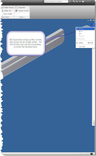
Here's an example. I'll admit that I 'faked it a bit' by dragging the window partially off the screen. But I want to show the effect.

(Click to Enlarge)

Of course, now we have to SOLVE the problem. It turns out that it can be easily fixed with a simple trick. Hit 'Alt+Spacebar'. This activates the tools for that window. Then hit 'M' for move.


Use your arrow keys and you can move the window back to the screen.

Once you know the trick, it's easy. The real trick? Just knowing the trick.

So if you've changed resolution, unplugged a second monitor, or switched to a different monitor, and all of a sudden you call up a window and the computer 'locks up'. Try this trick. The window may just be popping up off screen.

Talk about saving some frustration!


Wednesday, June 24, 2009

A 'Component' by any Other Name

Fate tried to conceal him by naming him Smith. ~Oliver Wendell Holmes, Jr.

Today I returned to Inventor today after spending some serious time with Autodesk Showcase. I'll be returning to Showcase soon. I've been on a mission to create some more renderings for the website (www.ketivtech.com)

But today I was asked a question that forced me to hunt around a bit.

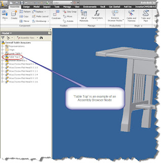
"How do I change the names of Assembly Browser nodes?"

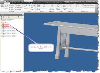
Here's an example of what the Browser Nodes are. When the files are initially created. The nodes inherit the file name of the component when it was created.


(Click to Enlarge)

I've run across this before. This time, I got that little light bulb in my head that said 'it's in there somewhere'.

So what did I do? I did what any good techie would do. I dove into Inventor (taking a moment to scoff at the instructions), and began clicking through tabs furiously, convinced that my expertise would help me locate the tool in no time.

About fifteen minutes and grumbling incoherently at my machine. I broke down and hit 'F1'.

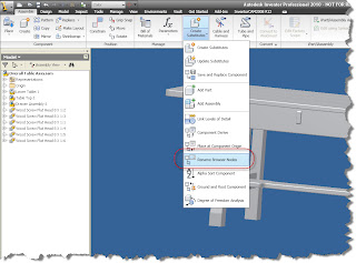
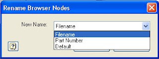
With the help of the appropriately named Help system. I found what I was looking for in no time. A tool named 'Rename Browser Nodes'

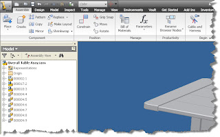
It's located on your Assembly Ribbon, under the Productivity Section. Click the arrow in the lower right hand side of the button to see all the tools.


(Click to Enlarge)


(Click to Enlarge)

Once you get the tool. You'll be able to rename the Browser Nodes to the Default (the original name). Filename (the filename, including the extension), and the Part Number (which will insert the Part Number iProperty).


(Click to Enlarge)

For example, I'm going to rename my browser nodes with the Part Number.

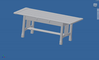
The assembly I'm going to use is a Craftsman style table I built as a project (my feet are resting on it as I type this). I modeled it in Inventor, created the drawings, and also used Producstream (now Vault Manufacturing) to create the a part numbers.


(Click to Enlarge)

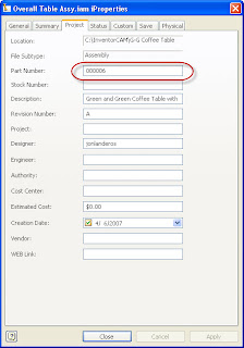
The numbering sequence is simple. It starts from 000001 and increases from there. No special numbers for assemblies, subassemblies etc. Here's an example of one of the part numbers


(Click to Enlarge)

In any case, all I want to do is renumber the browser nodes with my part numbers.

So.... You guessed it. I just choose 'Part Numbers' from the Window above.

With that done, my browser goes from this:


(Click to Enlarge)

To this:


(Click to Enlarge)


Once you know where it is, it's not really all that difficult. If you need to switch it again, just repeat the steps, and choose a new option!

Well, that's it, back to Showcase for a while!


Sunday, June 21, 2009

Lighting the Mood. Autodesk Showcase Lighting

Firelight will not let you read fine stories but it's warm and you won't see the dust on the floor. ~Irish Proverb

As I've been working with Showcase, I've started to try different things to see what effects they would have on the scene I was working on.

One of these was lighting, and particularly the color of lighting can have on a scene. I don't profess myself to be some sort of lighting expert, but here's some of the things I've learned from other users, and by poking around after saying 'I dunno, let's try it!"

By default, the colors of your lighting is white. For many scenes, that will be sufficient. But just like you can create an effect and impression, changing the light colors can add some nice touches.

One thing I've done is look a photos for inspiration. Here's an example of a picture I took at the Planes of Fame Museum in Chino, near my home in Southern California.

This F-86 Sabre is parked indoors, so it's lit mostly via skylights that let in natural light, but tint it slightly yellow.

But the tail is catching the natural light coming in through the open hangar doors, which is more of a natural white.


(Click to Enlarge)

You can use the lighting in Autodesk Showcase to simulate similar effects.

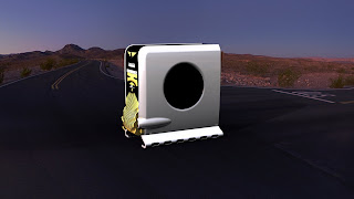
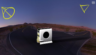
Here's a scene where I've used a personal computer in the 'Desert Dawn' environment (hey, don't we all keep our computers on desert roads?).

But this scene has a lot of red and blue hues in it, so it shows how the lighting can affect the look of a scene.

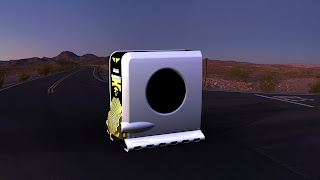
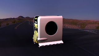
In this first picture, I've used all white lights. You can see how the computer looks 'bright' compared to the rest of the scene. Almost like it's been lit by an artificial light source. This is fine, it does make the the lit object standout (which may be the desired effect).


(Click to Enlarge)

There are currently two lights, one in front of the computer, and one in the back of the computer. For what I'm doing here, I won't change the lighting position at all, just the color.


(Click to Enlarge)

But what happens if we start changing the colors of the lighting?

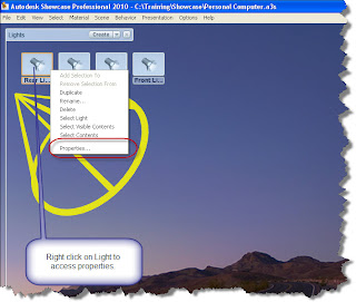
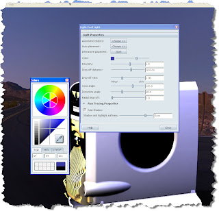
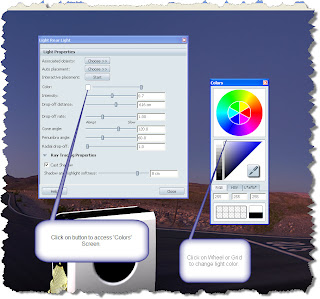
If I choose one of my lights, right click, and choose 'Properties', I can start to change the properties of my lighting. There's a lot of settings, but for now, I'll just focus on color.


(Click to Enlarge)

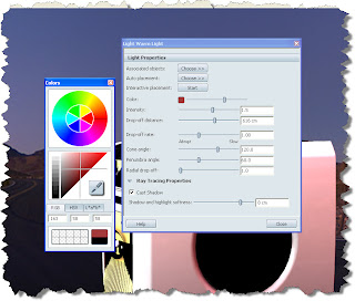
Once you choose properties, you'll see the light properties come up, you can click on the button that affects the color, bringing up the color screen.

With the color screen up, you can click on either the wheel, or the scale. Both will let you change the color of the light in their own ways.


(Click to Enlarge)


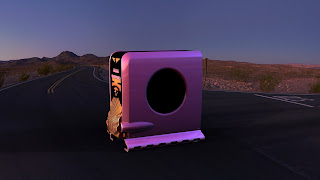
Now, I'm going to change the lighting properties of the light, and give it a red tone. Notice how the image looks different, it's a 'warmer' (at least that's my term for it) light.


(Click to Enlarge)


(Click to Enlarge)


Now giving the back light a blue hue.


(Click to Enlarge)


(Click to Enlarge)

Finally, you can change multiple lights, and see the effects. Here I've changed the front light to a red hue, leaving the blue light alone.


(Click to Enlarge)


The effect is pretty dramatic. Personally, I'd keep one of the white lights in there because the original color of the case (white) has been lost. But in many cases, it's about what your audience finds compelling.

That's it for now. Don't be afraid to experiment a little bit. You can always change the colors back!
On a parting note, here's a couple of more pictures I took of a Grumman Duck. Here you can see how the natural light coming in from the front hits the nose of the plane, highlighting the front of the airplane.

The natural light filtered by the skylights hit the rear of the plane (similar to the F-86 Sabre). You can also see in the different pictures where the lights come from (The windows in one picture, the skylights in the other).

I've found if I keep things like this in mind, it helps give me ideas on what to do with lighting to create better renderings in the future.

Besides, it gives me an excuse to run off to Planes of Fame and take pictures of cool old airplanes!


Natural light from front, you can even see some fill from the flash on the float (Click to Enlarge).


Filtered light from the skylights fills in the background. Notice how it interacts with the natural light hitting the front of the plane. I look at images like this to get ideas on how to place lights in Showcase.


Happy Monday all!