Danny Elfman
Today's blog is just a quick blog to say "Happy Halloween", and add a quick tip for Autodesk Showcase. .
Earlier today I downloaded a 3D model of a skull, in a STL format, from GrabCAD and imported it into Showcase.
But once the file imported. It looked dark. Almost like charcoal. It was like the environment light was having no effect on it.
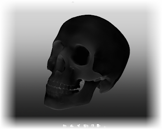 |
| This skull shouldn't look this dark. Somethings wrong (hint: check normals) |
Experience has taught me what the cause of this is. But not everyone may know the secret.
The normals on the skull were all reversed.
For those who may not be as familiar with surface normals, each surface in Showcase has a positive and negative side, often referred positive and negative normals.
While I can't say I know all technological reasons for the how the normals behave. I do know one thing. If the normals are backwards, which sometimes happens on imported models, the object won't light correctly. That's what's going on with the skull.
So now that I know what's wrong, how do I fix it?
- First, I went to the "Appearance" pull down menu and choose "Visual Styles Library".
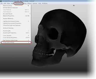 |
| Bringing up the Visual Styles Library |
- Once the Visual Styles Library menu appears, expand the "Diagnostics" section. This is where I find the option for "Normals". Choosing this option, I see that the entire skull shades yellow.
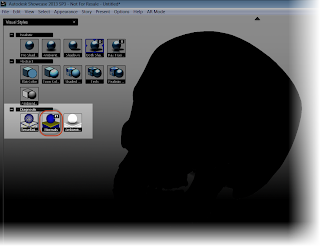 |
| Viewing the Normals |
- The yellow indicates that I'm looking at the negative side of the normal. This is why the skull isn't lighting correctly. Showcase is also helping me out by telling me to Select an object and hit the "F8" key to flip the normals.
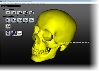 |
| The yellow tells me I'm looking at the negative (back) side of the normal |
- I can hit the F8 key or I can select my objects and choose Edit>Reverse Normals from the pulldown menus.
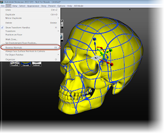 |
| Flipping the normals |
- The normals will flip, and the skull will turn blue. This tells me I'm looking at the positive side of the normals now.
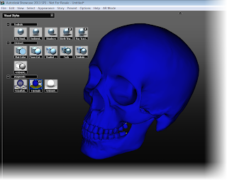 |
| The normals are flipped! |
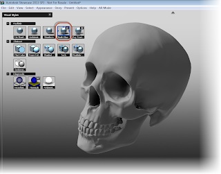
- Now, all I have to do is select a new option from the visual styles (I chose the "Both Shadows and Ambient Shadows" option)
- Now the skull looks a whole lot better, and I'm ready to complete the rendering. Add a few shadows and lights, and I have something I can say "Happy Halloween with!
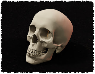 |
| The skull with some materials and lighting |
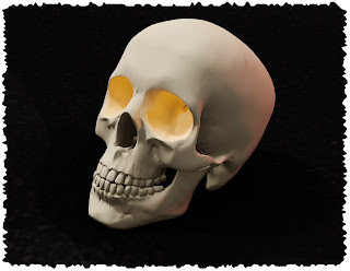 |
| And with glowing eyes! |

No comments:
Post a Comment