Ansel Adams
Autodesk Showcase. When I first started learning it, about three years ago, I was told by my mentor: "Remember that you want to catch the viewers eyes. Take a look at how photographers use things like lighting and camera angles.
What he was trying to tell me during his explanation, was that I needed to break my engineer's brain of perspective and isometric views. The goal is to create a rendering that grabs the viewers attention.
Some of the old tricks I learned, that I use to this day are playing with camera angles. I'll adjust camera tilt, focal length. and sometimes height.
As a matter of fact I shared these tricks in a blog back in June of 2009 (see that post here).
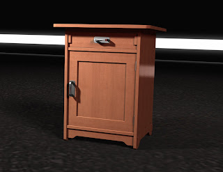 |
| Here's an example where I changed the camera tilt to add a more dramatic effect. |
But now! (drumroll) In Autodesk Showcase 2013, there are some more options! By going to the View>Camera Properties pulldown, there are more options are available.
 |
| The new camera properties. |
The new settings are for Image Control, and control the tone mapping for the rendering. Now there are more ways to adjust the appearance and quality of your scene.
Here's an example of a few of the settings:
Compensation: Think of this as exposure. Make a scene brighter or darker with a slider.
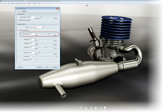 |
| A Showcase rendering with a compensation of 2.36 |
 |
| The same scene with a compensation of 1.36. Notice that this scene is darker |
Saturation: A favorite for me. I refer to this as the "Band of Brothers effect". This WWII based mini-series subdued the colors to give it an aged effect. This was accomplished by reducing saturation. Showcase 2013 can do the same thing!
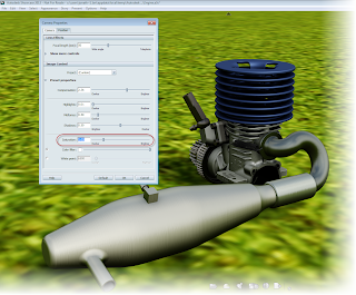 |
| A scene with the standard saturation of "1.0" |
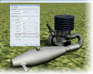 |
| The same scene, reducing the saturation to "0.5" |
Color Filter: Maps a new color to be "White". It creates a different feel for the scene.
 |
| Changing the color filter of a scene |
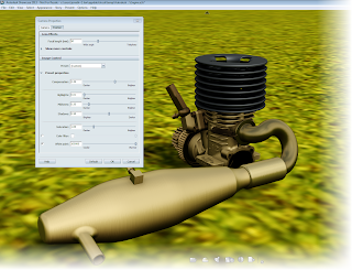 |
| An example of a scene shifted to the "full warm" setting. |
They can really add that extra pizazz!
And now, the video showing the tools. Give them a try in your next Showcase project!
Have some thoughts on how you make your renderings stand out? Tell us how in the comments!

No comments:
Post a Comment