Jesse Owens
A few days ago, I pulled the cover off my Autodesk Showcase 2013 installation, and took it for a test spin.
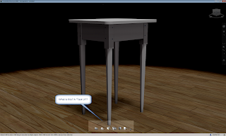
The first thing I found when I took a look, the user interface has changed. It's subtle, but it is significant.
 |
| There a new "Task UI" that's been added. |
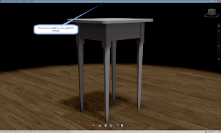
The pulldown menus are also hidden now. Although you can click on the arrow at the top of your screen to show them again. All the hotkeys from Showcase 2012 are still there too.
 |
| The menus can still be viewed. |
But I tried it for a little while, and I've found that it's not that bad. It wasn't that long before I was starting to get used to it, and (gasp) starting to like it.
So here's a quick video I put together on the new UI. It's just a preview. But as I dive further into Showcase, I'll be sure to post some more!
Taken a look at some of the new features in Autodesk Showcase 2013? Share you thoughts and drop a comment!

Hi Jon,
ReplyDeleteThe problem we've been having with showcase, is that the documentation isn't great and the UI is not intuitive.
First impression is that this is a leap forward. Thanks for taking the time to show it to us :)
-Paul-
Thanks, Paul!
ReplyDeleteI do think the changes will help quite a bit, especially if you're a new, or casual user who isn't intimate with all the hotkeys!
Check out the new ray tracing view
ReplyDeleteI love the new ray Tracing view
then its start width render level..0 1 2 .....
Johan