Anonymous
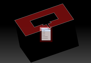
From the "subtle, but significant" category of Autodesk Inventor 2012, are the changes in the Select Other tool.
The "Old School" Select Other tool consisted of two arrows and a middle button to choose your option.
It worked great. It's been that way since I started way back when on Release 4.
 |
| The "Old School" Method Inventor 2011 and earlier |
 |
| The Inventor 2012 "List" of options |
I've had some time to get used to the list now, and I'm really beginning to like it. I don't have to click on the arrows over and over again. Now I just move my mouse over the options, until I see the one I want.
For me, it makes things a little bit quicker, and much, much smoother.
So with that, here's a video to compare the two!

No comments:
Post a Comment