Everything has beauty, but not everyone sees it. ~Confucius
I've blogged on bump mapping in Autodesk Showcase before, but with so many things in Showcase, it seems like it's as much art as science.
Of course you can add materials in Showcase, and in previous blogs (click here) I talked about how you can use bump maps to add 'character' to a material.
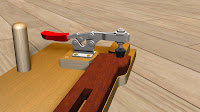
But at times, when trying to use bump maps, you end up with a ray traced image that seems to be grainy. Look at the clamp below. Everything seems fine, but the clamp definitely has that 'grainy' appearance.
You're first instinct might be to crank up the resolution, but it doesn't seem to help. Trust me on this: I've tried it. It eats up processor time, and doesn't improve the quality of the image. It also tends degrade the temperament of the operator.
But there is hope for both the image quality, and operator mood!
As with many things with Showcase, this is somewhat subjective, but one things that operator instinct seems to be to make a bump map far deeper than it needs to be.
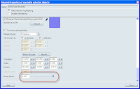
Even looking at the bump map that I've used (unaltered from the Showcase material library) has a bump depth of 1.0, which is pretty high. You might think it's the highest possible setting, but I've found that typing in a higher number will let you go higher than 1.0.

(click to enlarge)
The solution that I've found? I drop the depth of the bump map down. And when I say down, I start cranking it WAY down. I usually cut it in half, then half again, and repeat that process until I get to the result I like. So if I start a 1.0, I go down to 0.5, then 0.25, etc.
You should be able to find a value that works. In this case, I found that I got to a value of .125before I was happy with the result.
So you can see how just changing that bump map can change the look of the file. Other settings you can user are the angle of a bump map, as well as the scale. (For example, I also changed the angle and scale of the wood grain to make it more appealing).
While subtle, each of these settings play their part in helping create a rendering that is really eye catching.
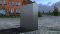
As another example, here's a box with only the bump depth changed. In the first image, the bump depth is at 1.0. I refer to this as 'having a brushed finish applied with a chainsaw). Feel free to use that, but I want the credit! :-)
Have fun trying different settings, and try something a little bit 'crazy'. You may find that it makes the rendering really 'pop'.
In which case, you get to make the transition from 'crazy' to 'visionary'.
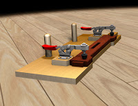
As for the jig? Here's teh full image, I cleaned up a few things, and gave it a tilt. Here it is in all it's ray traced glory.
Enjoy, and have a little fun trying different variations of these settings. I find it's when I'm having fun, I do my best work in Showcase.


No comments:
Post a Comment